
 |
Avoid Common Graphic Design Mistakes: A Guide for Beginners and Experts
Design failures can lead to project shortcomings, as up to 70% of design projects struggle due to poor design choices. In a world filled with visual content, good graphic design is not just a bonus; it’s a must. This article covers frequent graphic design mistakes and provides practical solutions to enhance your design skills.
Using Low-Resolution Images
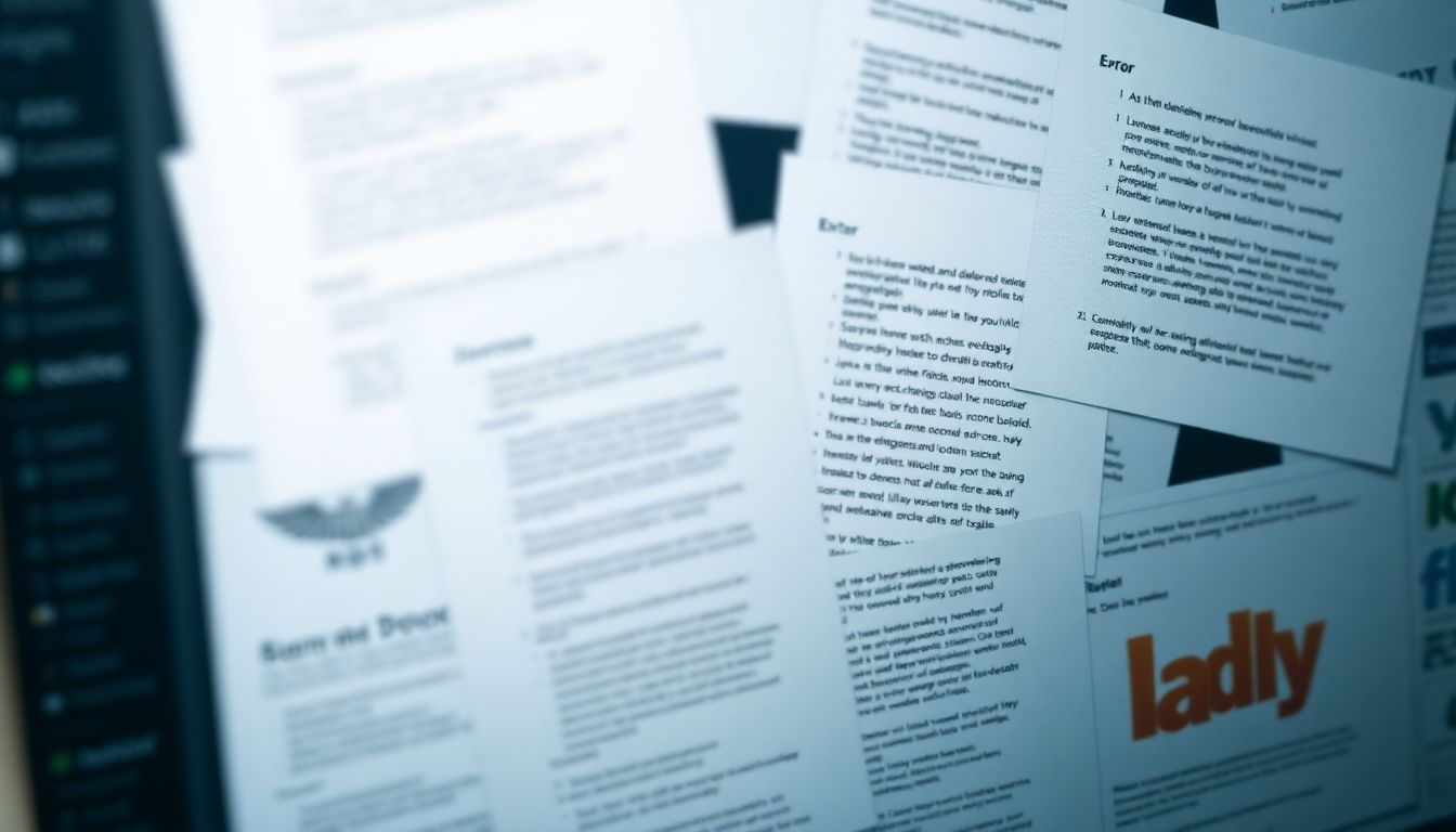
The Problem with Pixelation
Using low-resolution images can ruin the quality of both print and digital media. Pixelation can make designs look unprofessional, leading to a poor user experience. Research shows that a staggering 94% of users will judge a website's credibility based on its design, including image quality.
Finding and Using High-Resolution Images
To avoid this pitfall, always use high-resolution images. Sources such as Unsplash, Pexels, and Shutterstock offer excellent stock photos. Additionally, original photography can make your designs more unique. When optimizing image size, tools like TinyPNG or ImageOptim help maintain quality while reducing file size.
Scaling Images Properly
When resizing images, maintain the aspect ratio to avoid distortion. Use software like Adobe Photoshop or free alternatives like GIMP to scale images correctly. Always preview your images at the target size before finalizing any designs.
Ignoring Brand Consistency
The Importance of Brand Guidelines
Brand consistency is vital for recognition and trust. As noted by branding expert Marty Neumeier, “A brand is a promise. It’s the promise of an experience.” Without clear guidelines, your brand can lose its identity.
Maintaining Color Palettes and Typography
Using a consistent color palette and typeface strengthens brand identity. For example, renowned brands such as Coca-Cola and Apple stick to their specific colors and fonts. This consistency helps consumers easily recognize their products.
Applying Brand Guidelines Across Platforms
Different platforms like web, print, and social media may require adjustments to brand guidelines. Ensure your brand's voice, colors, and typography align across all channels for a unified presence.
Poor Typography Choices
Selecting the Right Font Pairings
Choosing the right fonts can make or break your design. Effective pairings, like Montserrat and Roboto, enhance readability. Conversely, mismatched fonts can confuse viewers and diminish impact.
Ensuring Readability
Readability is key in graphic design. Optimal font sizes vary based on media: 16 pixels for web text, and at least 12 points for print. Always consider font weight and spacing to improve legibility.
Avoiding Common Typography Mistakes
Common typography errors include using too many different fonts or neglecting proper kerning. Stick to two or three fonts to maintain cohesion. Proper line spacing can also help make your text easier to read.
Overusing Stock Photos and Clichéd Designs
The Problem with Generic Stock Photos
Many designs suffer from the use of generic stock photos, which can lead to a lack of originality. Studies indicate that 56% of stock images end up used repeatedly, diluting brand authenticity.
Finding Unique Visuals
Explore alternatives like custom illustrations, unique photography, or abstract designs. Designers like Jessica Walsh show how original visuals can significantly enhance brand identity.
Creating Original Designs
Creating original designs helps establish your brand's identity. Unique visuals set you apart from competitors and resonate with your audience. Invest time in brainstorming creative concepts and ideas.
Neglecting White Space and Visual Hierarchy
The Power of Negative Space
White space, or negative space, plays a crucial role in creating clean designs. It improves readability and enhances visual appeal. For instance, Apple’s minimalistic designs effectively use white space to draw attention to products.
Creating a Visual Hierarchy
A clear visual hierarchy helps guide the viewer's eye through your design. Use size, color, and placement strategically. Successful examples can be found in advertisements that highlight key information with larger fonts or bolder colors.
Improving Readability with Visual Hierarchy
Implementing a strong visual hierarchy enhances readability. By distinguishing headlines from body text through size and weight, readers can digest information more efficiently.
Conclusion
Avoiding common graphic design mistakes can significantly elevate your work. Remember, high-resolution images, brand consistency, thoughtful typography, unique visuals, and proper use of white space are crucial for compelling designs. Good design isn't just pretty; it's powerful and effective. Embrace these principles, and watch your design skills flourish. Aim for excellence, and let your creativity shine through your projects.


0 Comments