
 |
How to Choose the Right Colors for Your Designs: A Guide to Color Psychology and Aesthetics
Color plays a massive role in how we perceive brands and make buying decisions. Studies show that color increases brand recognition by up to 80%. Choosing the right colors for your designs is critical. This article will guide you through selecting colors that not only look good but also align with your message, exploring color theory, psychology, and practical applications.
Understanding Color Theory: The Foundation of Effective Design
The Color Wheel
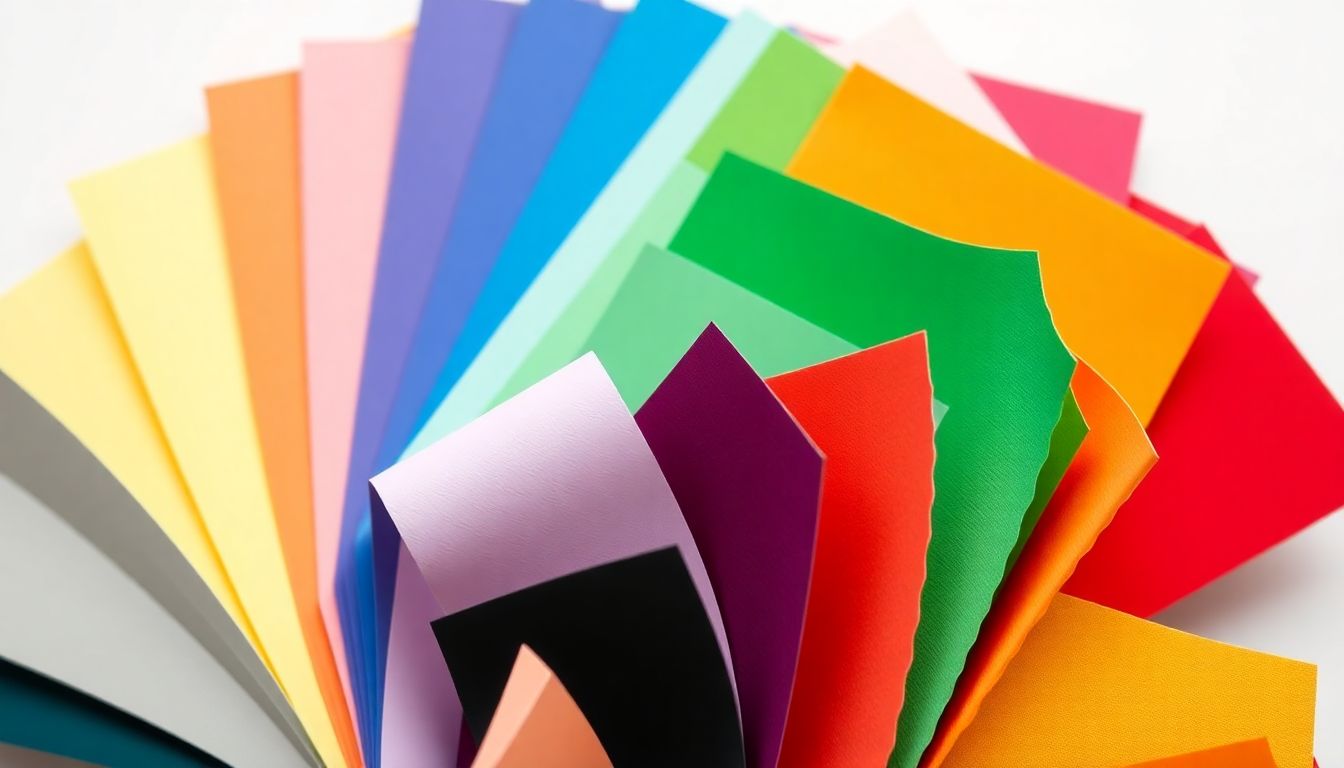
The color wheel is a fundamental tool for understanding colors. It includes primary colors like red, blue, and yellow, secondary colors like green, orange, and purple, and tertiary colors that mix primary and secondary colors.

Color Harmonies
Color harmonies involve groups of colors that work well together. Here are a few types:
- Complementary: Colors opposite each other on the wheel, such as blue and orange. They create high contrast and visual interest. Think of the brands that use this scheme, like Pepsi.
- Analogous: Colors next to each other, like green, blue, and teal. This scheme creates harmony and is often seen in nature.
- Triadic: Three colors evenly spaced around the wheel, such as red, yellow, and blue. This combination is vibrant and balanced.
Color Temperature
Colors can be warm (reds, oranges, yellows) or cool (blues, greens, purples). Warm colors often evoke feelings of excitement, while cool colors tend to calm and soothe. Understanding this difference helps in crafting the right emotional response in your audience.
Psychology of Color: Understanding Emotional Associations
Color and Emotion
Colors tap into our emotions. Here’s a quick list of common associations:
- Red: Passion, excitement, urgency
- Blue: Trust, security, calmness
- Yellow: Happiness, energy, caution
- Green: Growth, environment, tranquility
Research shows that up to 90% of snap judgments about products can be based on color alone.
Cultural Considerations
Colors can have different meanings across cultures. For instance, while white symbolizes purity in Western cultures, it often represents mourning in some Eastern cultures. Considering these differences is crucial for global brands.
Accessibility and Inclusivity
Color contrast is vital for those with visual impairments. Following the Web Content Accessibility Guidelines (WCAG) ensures that all users can interact with your design effectively. Use contrasting colors for text and background to make content easy to read.
Choosing Colors for Your Brand Identity
Brand Personality
Your brand's personality should guide your color choices. A playful brand may use bright colors, while a luxury brand might opt for deep hues. Align your colors with your values to create a strong brand identity.
Target Audience
Understanding your target audience is key. Different demographics have varying color preferences. For example, younger audiences might favor vibrant colors, while older groups might prefer muted tones.
Competitor Analysis
Analyze your competitors to find gaps in their color schemes. If most brands in your industry use blue, a bold red can make you stand out and grab attention.
Practical Application: Tools and Techniques for Color Selection
Color Palette Generators
Several online tools help create color palettes effortlessly. Here are a few to try:
Color Picking from Images
If you find an image with colors you love, tools like Adobe Photoshop or online services can extract color palettes. This allows you to build on existing inspiration.
Testing and Iteration
Once you have a palette, test it with real users. Gather feedback to ensure that the colors resonate with your audience, and don’t hesitate to tweak them based on their input.
Incorporating Color into Different Design Types
Web Design
In web design, colors affect usability and navigation. Websites like Apple use clean white backgrounds with subtle gray text to enhance readability. This approach helps users focus on the products.
Graphic Design
In graphic design, colors play a crucial role in logos and printed materials. For example, Coca-Cola’s iconic red and white logo evokes excitement and happiness, making it memorable.
UI/UX Design
In UI/UX design, colors must promote clarity and consistency. Using a limited color palette can simplify user interactions, making it easier to navigate apps and websites.
Conclusion: Mastering the Art of Color Selection
Choosing the right colors is essential for effective design. By understanding color theory, psychology, and the practical aspects of color application, you can create impactful designs. Experiment with different colors and don’t hesitate to refine your choices. Share your favorite color palettes and let creativity guide you!


0 Comments